New Interactive Tools and Data to Explore Mitigation Bank Timelines
Special thanks to EPIC colleagues EmmaLi Tsai and Gabe Watson for their expert guidance and careful review of the data and code.
EPIC is excited to release new data and visualization tools to explore the processing timelines for mitigation banks approved by the US Army Corps of Engineers (USACE). You can:
Compare your district's performance to the national average
Identify which districts consistently meet the 225-day federal deadline
Spot outlier banks that had unusually long or short processing times
The data and code is the foundation of the research we published in October 2024 - The Time It Takes for Restoration (2024 Update): An Updated Quantitative Analysis of Mitigation Bank Timelines. How you want to interact with the data depends on the depth to which you want to nerd out with the data. We provide options going from easy-peasy to let’s download and code.
And by the way, if you find value from these tools and data, why not consider making a donation to EPIC to support us?
Easy: Online Data Visualizations of Key Mitigation Bank Timeline Analysis
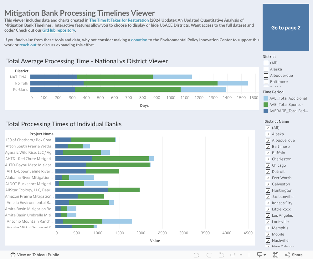
The public mitigation bank processing timelines viewer below shows:
The National vs. District(s) total average processing time [embed link], in stacked bar charts showing time on the regulator’s desk (dark blue), time on the sponsor’s desk (green), and “additional” time (light blue) where it was not possible to assign the time interval to regular or sponsor. It’s set showing a default of the national average timeline, and a few Districts. Using the checkbox menu, you can select which District(s) you’d like to compare.
Total processing times of individual banks, again in stacked bar charts. Using the checkbox menus, you can filter by District or by individual bank(s).
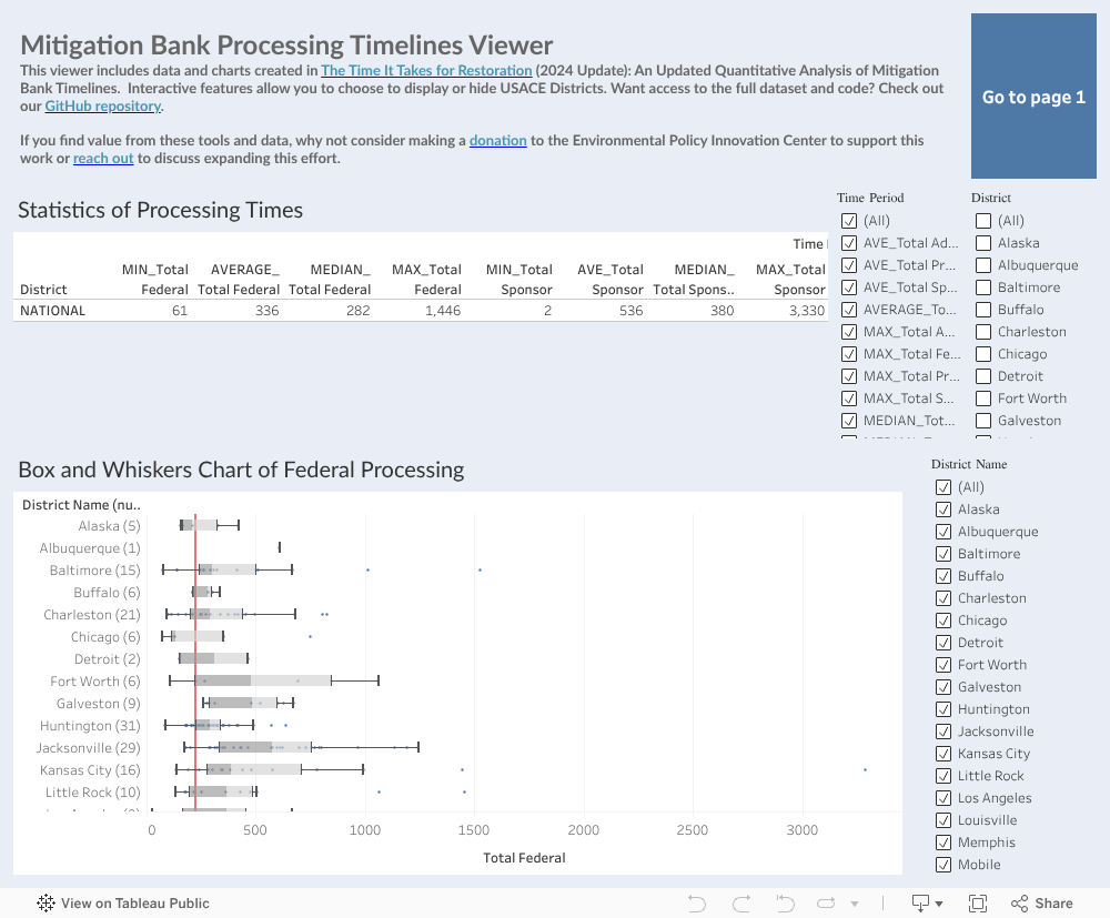
If you want to explore nerdier stats, check out the second workbook. This ‘stats’ viewer shows:
Statistics of different processing time categories (Federal, Sponsor, Additional, and Total). Using the checkbox menus, you can choose which District(s) you’d like to show and which time period categories/stats (e.g., min, average, median, max days of processing time).
A box and whisker chart of the federal processing time only, by District. The red line indicates the 225 day mandatory processing time. Districts are sorted by fastest median federal processing time at the bottom, and slowest at the top. The number in parentheses by the District name indicates the number of banks in the dataset. You can again choose which Districts to display.
Medium: Download a Simple, Cleaned Dataset and Have at It Yourself

We published a cleaned and simple dataset here.
This represents all banks, and timelines categorized by federal, sponsor, and additional processing time. There is an indication of whether the bank was an outlier (in the 1st or 99th percentile by federal processing time).
Hard: Let’s Download and Code
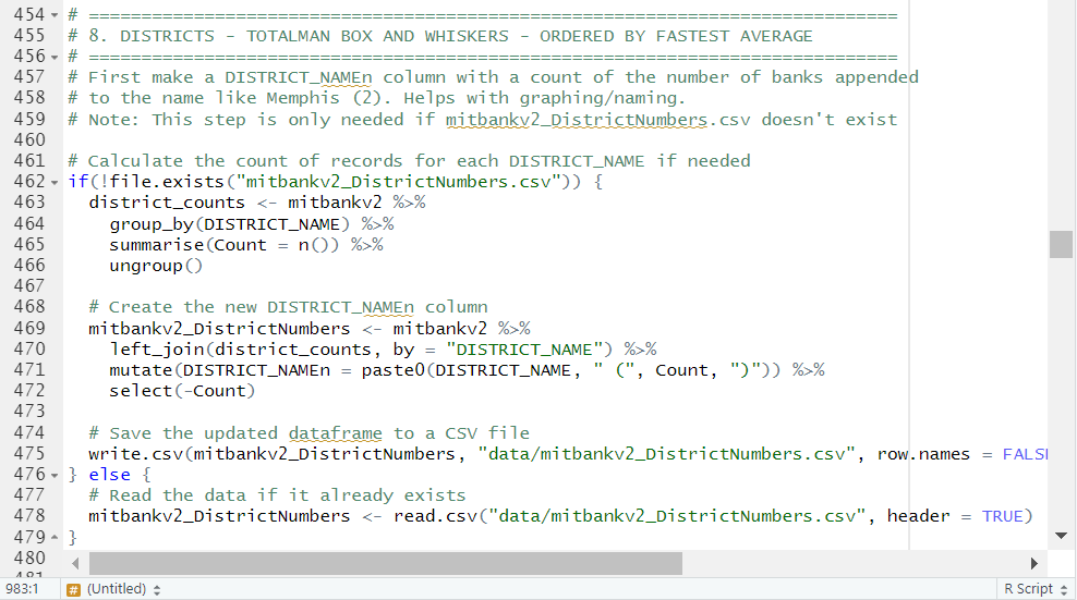
For the true hard-core fans, we published the full dataset, data dictionary, and the code used for data cleaning and analysis here.
The data includes what was provided in the raw data, along with interim calculations and the final calculations of the time periods by categories. The data dictionary explains what the data fields mean, and the code is… well, the code, in R programming language.
Whether you're a practitioner trying to set realistic client expectations, a regulator benchmarking performance, or a researcher studying environmental policy implementation, these insights can inform better decision-making.
NEED A CUSTOM VISUALIZATION OR ANALYSIS? Reach out to becca@policyinnovation.org to begin a conversation.